Not So Blue
12 years, 1 month ago
Blog
Comments Off on Not So Blue
I don’t do blue.
I’ve never bought a piece of clothing that’s blue, never worn jewelry that’s blue, never painted a room blue. In my lifetime, I’ve had a rainbow of favorite colors: Pink when I was a little girl; green as a wanna’ be hippie my freshman year in college; purple and black as a committed radical later on. Currently, my number one shade is red – Pyrrole, to be exact. But blue? It’s just never been my hue.
Until I started painting, that is.
The first time I picked up a brush and put it to canvas was during an Introduction to Painting class at the California College of the Arts in Oakland. It was 2007, and I was a tired mom of two very young boys, new to East Bay and itching to do something creative with my brief moments of free time. I didn’t want to sit at my computer; that felt too much like my pre-motherhood work as a writer and editor. Discussing my options with a painter friend, she suggested I try a few exercises from Betty Edward’s Drawing on the Right Side of the Brain. So I did.
 I quickly discovered that I loved sitting and sketching, thinking about lines and angles and shapes. But I knew with my limited time, it would take years for me to get through the assignments in the book. Instead, I looked online for a drawing class and discovered that a) I lived three blocks from CCA and b) a Basic Drawing class was starting in two days’ time. I signed up, and for the next six weeks, I dedicated two evenings a week to sketching in charcoal, graphite, and pencil.
When that class ended, I enrolled in another basic drawing class with a different instructor. I enjoyed both classes, but as I made marks in black and shades of grey, I became increasingly aware of my desire to create something in color.
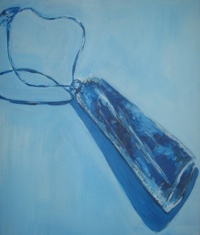
So I signed up for a Saturday morning Beginning Painting class. I don’t remember much of what was said during that first class, until our instructor gave us our first assignment: To paint something small – I chose the greenstone necklace I was wearing – and to fill the canvas with the image. The hitch? We could only paint in one color, plus white and black to create shades and shadows. The instructor walked around the room with tubes of red, blue, and yellow paint so we could select our color. My hand hovered over each of the paint tubes as I imagined my necklace in each of the primary shades before settling on blue.
 My painting turned out fine – nothing noteworthy, but not a bad effort for a neophyte. What was significant, however, was the blossoming of my new relationship with the color blue. For the next few months, as I became more and more taken with – perhaps even obsessed with – painting, I realized that blue appeared on every canvas I brushed. If I didn’t under-paint the whole surface in a cool, light blue (white blended with ultramarine), then I combined ultramarine, cobalt and cerulean to create ocean waters roiling with deep dark blues and vibrant turquoise. I painted blue vases, blue skies, and blue backgrounds. The pieces weren’t particularly good, but that wasn’t the point.
What I found curious was that despite a lifetime of ignoring the color blue, I found myself using – in fact, needing to use — some shade of blue to offset or punctuate almost every one of my early paintings, whether to make a still-life of my bright red boots pop off the canvas or to dramatize dark waters under a stormy sky.
This predilection for blue took me by surprise. But as I thought about it, it began to make sense. I grew up in the South Island of New Zealand, an island nation that is, naturally, surrounded by water. I watched the waters of the South Pacific every day of the first 16 years of my life, whether it was driving from our bay town into the city during school days or spending hours at the beach digging for clams (pipis, in Maori) or hunting for seashells on the weekends.
The water, which never looked the same twice, became part of my worldview – part of my DNA — without my realizing or even thinking about it. In the years that I’ve lived outside of New Zealand, the times I’ve been most aware of a nearby ocean, lake, or bay is when there isn’t one. Without at least a daily glimpse of liquid blue, I discovered I felt uncentered, as if something fundamental was missing or just plain wrong. When I lived in the high desert of Santa Fe, New Mexico, the endless, ever-changing skies gave me an ersatz ocean fix, but I was perpetually lost in the city without a body of water by which to situate myself and help me find my way.
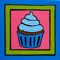
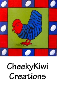
 Quite unexpectedly, I think the color blue has helped me find my way with painting, too. It’s still very much a part of my palette, even though for now I’ve replaced images of skies and water with blue-striped chickens and imaginary turquoise flowers. I like the way the vibrant shades of blue I create help ground my images when placed next to the eye-popping reds, greens, and oranges I’m also drawn to. Blue brings its own sense of whimsy and lightness to a canvas, too, whether it’s in a heart-filled cerulean sky or a cobalt-frosted cupcake. And no homage to the flag would be complete without a deep, somber blue behind the bright white stars.
Joni Mitchell was moved by the spirit of blue when she wrote a song* in its honor:
Blue, songs are like tattoos
You know I’ve been to sea before
Crown and anchor me
Or let me sail away
Hey Blue, here is a song for you
I’m no poet or songwriter, but the least I can do for a color that has inspired, challenged, motivated, and moved me is this:
Hey Blue, here is a blog for you.
What’s your favorite hue?
*Blue, copyright Joni Mitchell, 1970
Tags:Art, art classes, blue, CheekyKiwi Creations, favorite colors, joni mitchell, painting, right side of the brain
This entry was posted on Monday, April 16th, 2012 at 4:25 pm
You can follow any responses to this entry through the RSS 2.0 feed.
